PowerBI Soda Sales Dashboard
An interactive Power BI dashboard analyzing beverage sales data across the United States.
This project showcases a dynamic Power BI dashboard designed to analyze soda sales data across multiple dimensions, including revenue, units sold, pricing, and regional performance. The dashboard is tailored to provide actionable insights for business stakeholders, enabling them to identify trends, monitor key performance metrics, and optimize strategies for different beverage brands.
The primary objective of this dashboard is to support data-driven decision-making by presenting complex sales data in an accessible, visually engaging, and user-friendly format. With dynamic filters, such as brand selection and geographic drilldowns, users can customize their view of the data to focus on specific areas of interest. This feature-rich dashboard demonstrates my ability to work with large datasets, design intuitive interfaces, and deliver insights that drive business outcomes.
Key Features
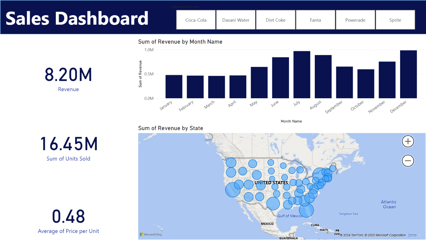
Key Performance Indicators:
The KPIs section summarizes key performance metrics, including total revenue ($8.20M), units sold (16.45M), and average price per unit ($0.48). These KPIs provide a quick snapshot of overall performance, allowing stakeholders to instantly gauge the health of sales operations.
Sales Trends:
A bar chart visualizes revenue trends by month, making it easy to identify peak sales periods. For example, revenue spikes in June and July reflect seasonal demand, likely driven by summer consumption patterns. This visualization helps stakeholders plan inventory and promotional strategies around high-demand months.
Regional Sales:
An interactive map showcases revenue distribution by state, with bubble sizes proportional to revenue generated. This allows stakeholders to identify top-performing regions, such as the southern and midwestern states, and target marketing efforts accordingly. The map also highlights underperforming areas, presenting opportunities for growth.
Dynamic Filters:
Filter buttons for beverage brands, including Coca-Cola, Sprite, Fanta, and others, allow users to customize the dashboard for brand-specific analysis. This feature provides flexibility for stakeholders to drill down into individual brand performance and gain deeper insights.
Key Insights
The analysis reveals several notable trends in beverage sales. Revenue peaks during the summer months, particularly in June and July, driven by high demand for Coca-Cola and Sprite. Southern and midwestern states consistently rank as top-performing regions, contributing the most to total revenue. Meanwhile, the average price per unit remains stable across all regions, with only minor fluctuations. These insights help inform targeted marketing strategies, efficient inventory planning, and regional focus areas for maximizing profitability.
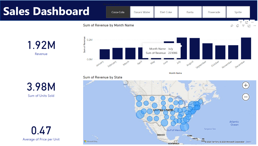
This screenshot highlights the dashboard’s focus on Coca-Cola sales, demonstrating dynamic filtering. By selecting Coca-Cola, the dashboard updates in real time to display metrics like total revenue, units sold, and average price per unit. The bar chart provides a month-by-month breakdown, with July standing out as a high-performing month, generating $223,086 in revenue. Users can hover over bars to view exact figures, while the map visual showcases Coca-Cola’s revenue distribution across states, enabling deeper exploration of regional trends. This interactivity makes the dashboard intuitive and actionable for stakeholders.
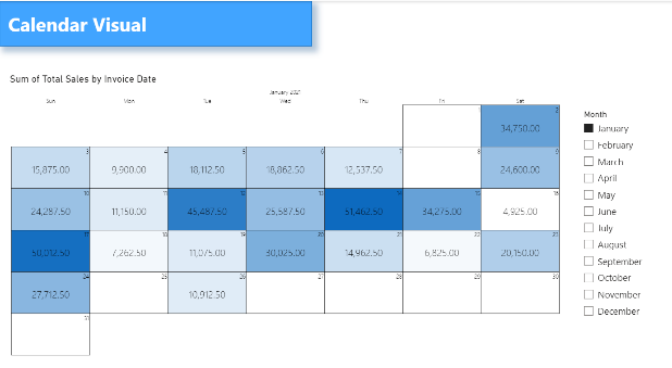
The “Soda Sales Dashboard” has been enhanced with additional visuals to provide more granular insights into sales data. These visuals include a Calendar Visual to analyze sales trends on a daily basis. Decomposition Trees to break down sales performance by region, state, and city, and a Line Chart with Bookmark to dynamically explore sales trends by year, quarter, and month. These additions improve the dashboard’s ability to uncover patterns and trends, enabling better decision-making.
Calendar Visual: The calendar visual showcases the sum of total sales by invoice date, offering a detailed daily view of sales trends. Sales are represented on a calendar grid for easy day-to-day comparison, and the month filter allows dynamic switching between months to identify trends. Peak sales days are easily identifiable, such as the 13th and 17th of the month. This visual also allows for detection of underperforming days, which can help optimize operations.
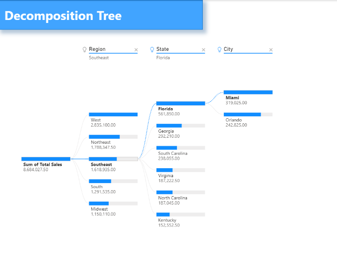
Decomposition Trees (Southeast and West): To break down sales performance by region, state, and city.
Line Chart: This line chart tracks sales trends over time and includes bookmark functionality for dynamic exploration. It allows switching between views (Year, Quarter, Month, Day) using bookmarks and visualizes seasonal or monthly trends in total sales. Peak sales were observed in Q3 and Q4, with notable growth in November. The chart helps identify periods of high and low sales activity for better forecasting.
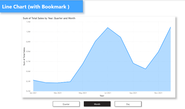
The Calendar Visual highlights daily sales patterns, making it easy to identify high and low-performing days. The Decomposition Tree provides a detailed breakdown of sales across regions, states, and cities, with actionable insights for performance improvement. The Line Chart with Bookmark enables dynamic exploration of time-based trends, showcasing periods of growth and opportunities for optimization. These enhancements make the “Soda Sales Dashboard” a comprehensive tool for analyzing and optimizing sales performance.