Adidas Interactive Sales Dashboard
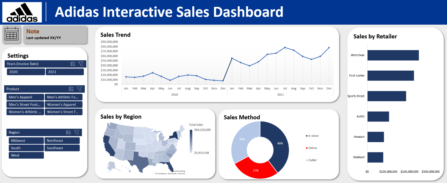
This project demonstrates my ability to design interactive dashboards and analyze complex datasets, helping businesses make data-driven decisions effectively. Built in Microsoft Excel, the dashboard provides a comprehensive analysis of Adidas sales data, showcasing trends, regional performance, retailer contributions, and sales channel distribution. It’s designed to enable stakeholders to explore data dynamically and extract actionable insights.
Key Features and insights include:
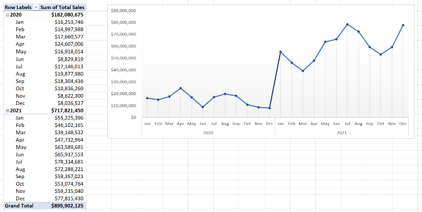
Sales Trend Analysis: A line chart displaying monthly sales performance over two years provides insights into trends, seasonal spikes, and overall growth patterns. The chart shows significant peaks during November and December, aligning with the holiday shopping season, and highlights steady growth in online sales across the period. This visualization helps stakeholders identify key
sales periods and evaluate performance trends over time.
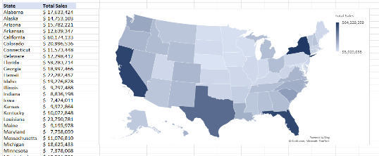
Sales by Region: The heatmap allows users to quickly identify geographic strengths and opportunities for growth. Drill-down capability using slicers enables a more detailed view of specific regions or states, making it easier to tailor regional strategies.
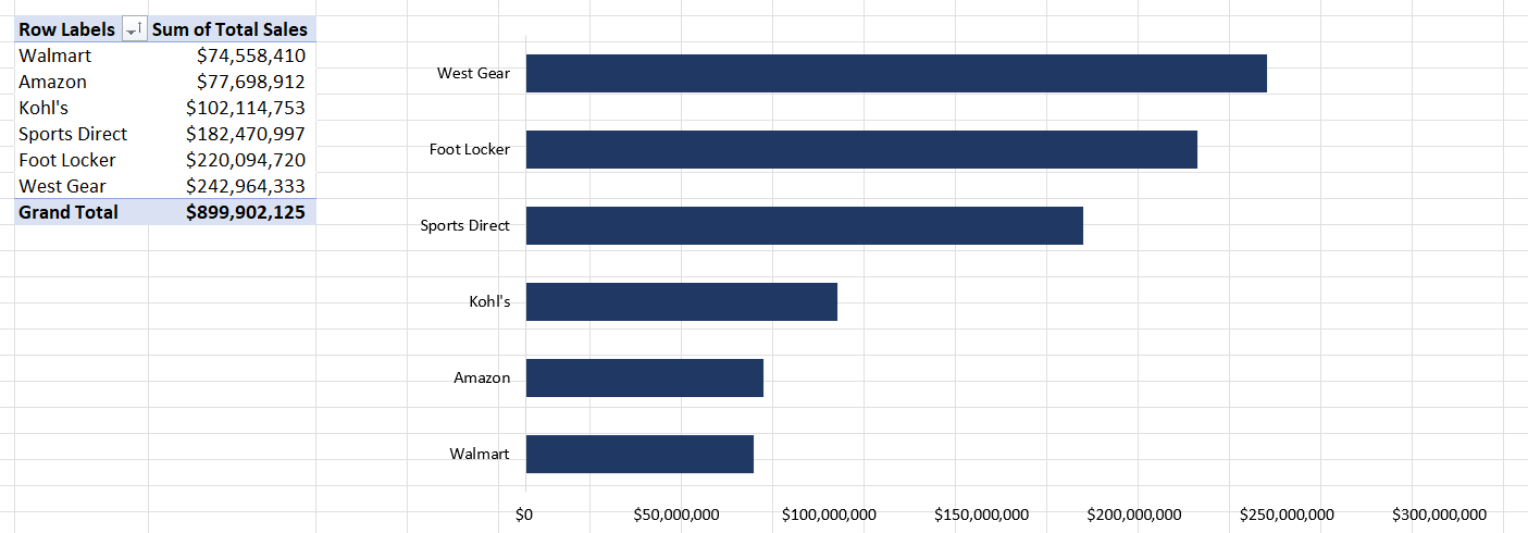
Sales by Retailer: A bar chart highlights revenue contributions from top retailers, such as West Gear and Foot Locker, which together account for over 50% of total sales. Supporting data was prepared using Pivot Tables, ensuring flexibility to display data by multiple dimensions like product category or region. This feature provides insights into which retail partners are the most profitable, helping prioritize partnerships and resources
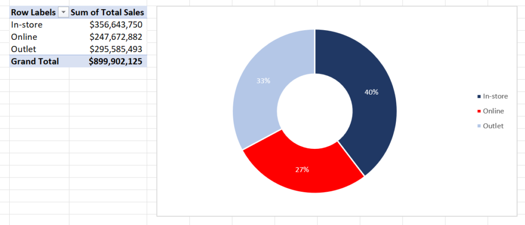
Sales Method: A pie chart visually represents the distribution of sales across channels, showcasing a clear and engaging breakdown. Integrated with slicers, the chart updates dynamically, This visualization highlights the dominance of in-store sales, contributing 40% of total revenue, while online sales, at 27%, reflect changing consumer preferences
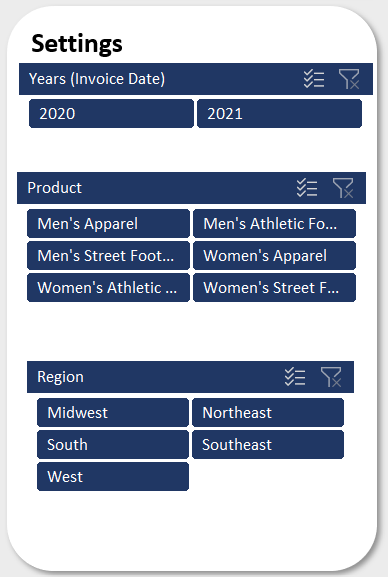
Interactive Filters: The dashboard incorporates user-friendly slicers that allow users to slice and dice data by year, product category, and region. These filters enable dynamic exploration of the data, making it easy to uncover actionable insights. For example, users can filter by specific years to analyze trends during the pandemic or select a particular product category to see its regional performance.